Vegan Yogurt – NFS
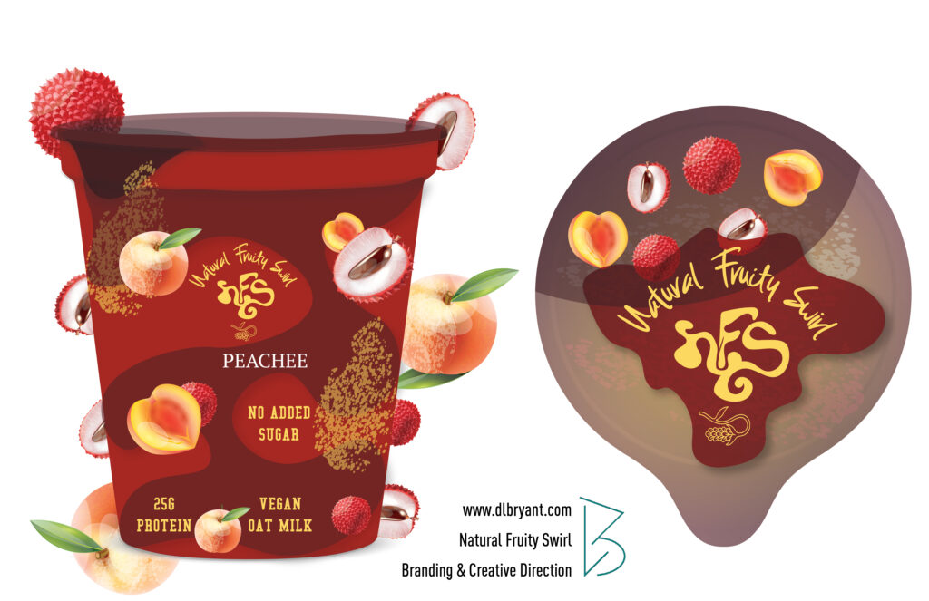
The design has texture from fruits embedded into the packaging design. This is important for the whimsical design approach, but also for cohesiveness. The attention to even the smallest details matter. The textures of fruit have organic/abstract shapes. The lid design has a pop art effect, which is also the same design used for the key chains, patches, and stickers when the company is at a venue or event to pass samples to customers who will see this same design repeated on the product when in store.
Each packaging design is color coordinated with the fruits being used. Since the company does not use artificial flavoring, have chunks of each fruit used in the product itself, it was also important to use every aspect of the fruits as much as possible within the design.
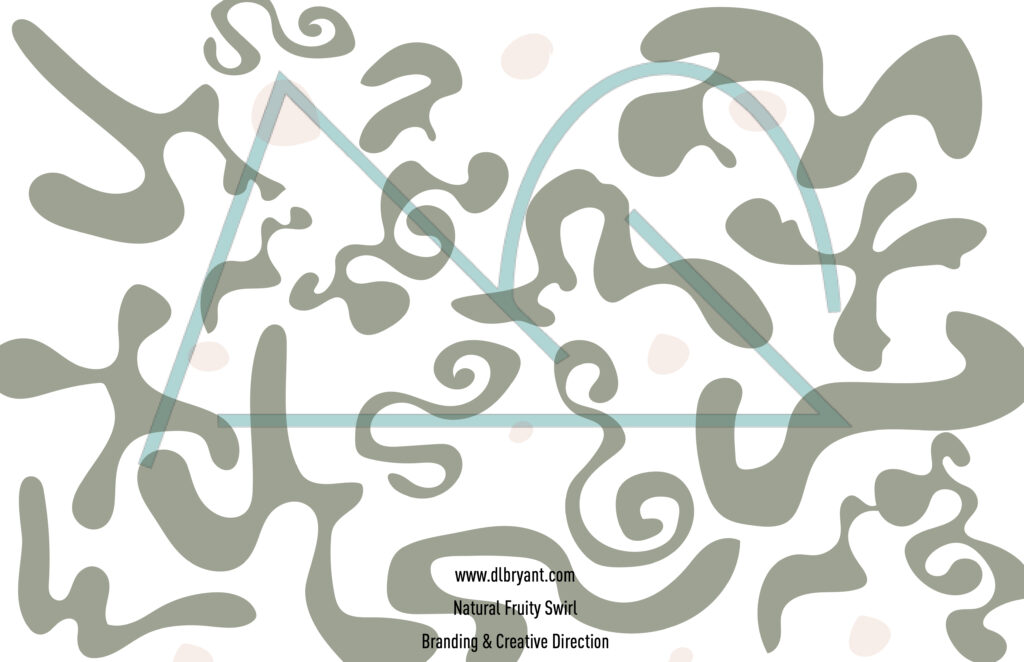
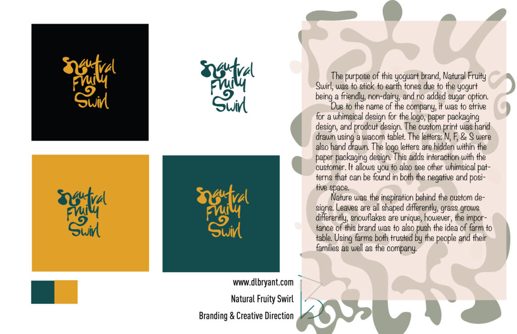
Natural Fruit Swirl Vegan Yogurt | Creative Direction | Logo & Branding: Hand drawn organic shapes for packaging, key ring, and logo were scanned within Adobe Illustrator later drawn with a Wacom Intuos Tablet.


